What’s your Type? Understanding Typography
Picking the right font can make a huge difference in mood, tone and readability. This handy guide provides a basic introduction to typographical terms and tips on choosing the best typeface for the job.
The goal of typography is to convey information to the reader. We’re after readability. To get there, it helps to know something about type.
Some typographical terms
A collection of letters designed to be used together is called a typeface. A typeface may come in different weights (light, bold), different widths (condensed, extended), different styles (italics, underlined, outline), and different sizes (by point). Together, these variations make up a typeface family. Type families are often named for their designer (Bodoni, Garamond, etc.). Technically, a “font” is a particular size, weight, width, etc. of one typeface.
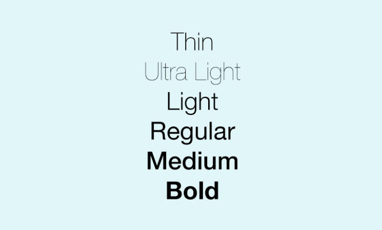
Weight names can be confusing, because different manufacturers use different names. Lightface, boldface, medium, demibold, ultrabold, heavy, black — these are all words used to describe weights of type.
Letters have ascenders (the part that pokes up) and descenders (the part that pokes down). The size of a letter is from the top of an ascender to the bottom of a descender. It used to be that you’d pick up a slug, and could measure it to check the size, but now it’s harder. Measuring type is tricky, and not an exact science. A 48-point letter may not be exactly 48 points. The size of type is measured in points, and is called point-size.
Leading (pronounced “ledding”) is the space between lines of type. This is usually determined when the paper is designed, and preset into style tags used in a paper. Typically leading is the size of the type plus 10 percent. So for 10 point type, you’d use 11 points of leading. Extra leading makes type easier to read. Extra leading should be used for wide columns of type. When type is set without leading, it’s called “set solid.” There’s a little space still, because of unused ascender and descender space.
Type that isn’t italic and has serifs (the little horizontal lines that form “feet” of some characters) is called Roman type. Slanted letter shapes are called italics. San serif faces don’t have serifs (“sans” means “without), and are also called Gothic. What you probably think of as gothic type is actually called text — it looks like medieval calligraphy, and is often mistakenly called Gothic because it looks like it came from a Gothic cathedral. It’s called text because a bunch of it set together looks like it has a texture. This type is very hard to read in all caps. Then there’s script type, which looks like handwriting done with a brush or caligraphic pen. Cursive type looks like script but is more ornate.
Spaced out
Spacing between lines of type is an important consideration. You also need to know about spacing between decks of a headline, between a headline and the story below it, between a headline and the story above it, between your story and artwork or ads, between paragraphs, between subheads and body type, between words, between letters.
For headlines, keep the decks close enough together so the headline all hangs together, but allow enough space so it’s easy to read. Don’t let a headline sit right on top of a story; leave about a line of space, (12 points or one pica). If there’s another story above your headline leave one-and-a-half to two lines of space — the headline should be closer to the story it goes with than to the preceding headline.
Leave a pica of breathing room between body copy and ads, illustrations, lines, boxes, etc.
Spacing between words can be expanded and contracted, as needed to fill out space. Same with spacing between letters. Sometimes this is called tracking, and tight tracking pushes things together, while loose tracking spreads them out. If your headline is too long to fit, you can sometimes squeeze it in by changing the tracking.
Another name for tracking is kerning. This used to be a real art form for typographers, but it’s largely done by computer now. It’s based on the realization that some letters fit together nicely, and therefore can be squeezed closer together. For instance, if a capital “P” is followed by the letter “o,” you can squeeze the “o” in under the curved part of the “P.”
The goal is to keep type from calling attention to itself. If the reader is left thinking “that sure is cramped” or “that sure is spaced out” you’ve made a mistake.
Picking type
Choose typefaces that look good and are easy to read.
A variety of factors go into making a typeface easy to read. Higher x-heights are easier to read. Letters that use most space for their x-height and less for ascenders and descenders are easier to read. Letters that are more round than oval are easier to read — you can see a pumpkin easier than a goose egg. You can measure that by typing out the alphabet in different faces. This measure is called lca, lowercase alphabet length. An 8-point type with an lca of 118 is sufficiently round.
Body copy is most of the type in your magazine or newspaper. It’s the stories. This must be a readable typeface. Studies have found that normal typefaces are easiest to read — they’re what we’re used to. Italics, condensed letters, extended letters, capital letters, unusual typefaces — these all slow reading.
Serif typefaces are more readable than sans serif faces. The little serifs in letters form a horizontal flow, and help pull the reader along. They also give a letter’s shape more definition, providing faster recognition. The eye has a hard time making out minor differences in letter shapes, and serifs provide extra clues.
Here are some more tips for picking typefaces:
- Line lengths — minimum is 32 characters, maximum is 64 characters, and ideal is 42 characters. This is based on readability studies. That means three columns on a magazine page, four columns on a tabloid page, and six on a broadsheet.
- Usually columns of type are “justified.” This means that each line of type fills out the entire column. Type can also be set “ragged right” (the lines line up at the left, but not the right), or “ragged left” (the lines line up at the right, but not the left). Justified is easiest to read. Ragged right isn’t too bad, and can be used for effect. Ragged left is very difficult to read, because the eye isn’t sure where to go when it jumps back to the beginning of the next line. Repetitive tasks like reading lines of type are best done in a rhythm, and justified type gives the eye that rhythm for reading.
- As your audience ages, they’ll find larger type easier to read. Body copy runs from nine to 11 point, but for an older audience 10-14 is good, with extra leading. Older readers may also have trouble reading reversed type or type on tinted backgrounds. If you use a tinted background, make sure it’s very light.
- Most often you will use boldface for headlines. Two common strategies are to use the bold version of your body copy, or use a sans serif headline font to go with a serif body font.
- Use reverse type (white letters on a black or colored background) sparingly, because it’s harder to read. When you want to use reverse type use sans serif faces, because the serifs fill in because of dot gain.
- When you use a novelty typeface for a headline, be sure to surround it with lots of white space, so readers can pick out the letters. Think twice, and then think again before using novelty type. It’s often a cheap gimmick that distracts from the article.
- Don’t use all caps in a headline — the shape of a word helps a reader make it out, and all caps words all have the same shape. Lowercase is easier to read. That’s why headlines have gone to a downstyle — capitalizing only when necessary, rather than capitalizing the first letter of each word.